Five Questions About Mood Boards
Every designer has essential steps in their process. One of mine is creating a mood board. I first learned about them in my branding design class at Savannah College of Art and Design, but it wasn’t until my first job that I got to see the value of a mood board in communicating with clients and clarifying design preferences. I’ve been hooked since then. I am constantly refining and adjusting my approach to mood boards based on what I learn from different clients. In today’s blog post, I’m going to break down how mood boards serve my design process and help you think about how they can fit into yours.
1. What IS a mood board?
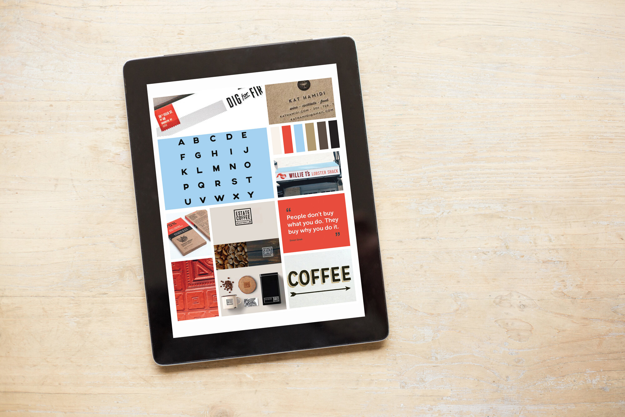
A mood board is essentially a discussion tool to make sure the client and I are on the same page. They communicate the overall purpose and inspiration for a design. Based on someone’s life experience and tastes, different adjectives can have different visual associations. For example, the word “active” might cause one person to picture a long power walk in the woods, laughing with a friend (maybe there’s a dog), while another person imagines lifting weights in a gym, a third thinks of competitive sports, and yet another person pictures keeping a house running, chasing a toddler and doing errands. I want to make sure I’m speaking the same language as the client, so we examine adjectives like active, fun, dynamic, etc., to see how they translate visually for each individual.
2. When do you create mood boards?
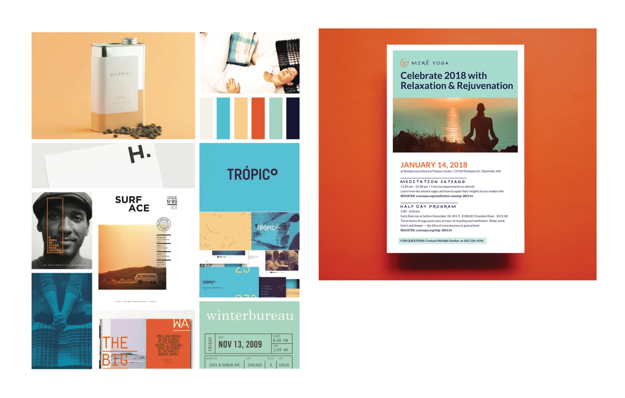
I create the mood boards near the beginning of the design process. I begin new client relationships with a discovery session where we talk about the goals of the project and clarify the adjectives that describe the brand’s look. I ask questions like: “What are the impressions that you want people to take away from interacting with your brand?” These conversations inform the mood boards. For instance, the Headley Carter Cares Foundation’s main goal was for the design to represent a balance of the board’s knowledge and experience and the dynamic, resilient nature of the children who engage with the foundation. Through the mood boards, we clarified that this translated visually to warm and inviting colors like teal, orange and tan, tactile texture, and an organic, imperfect illustration style. (You can read more about this project in my behind the scenes post) It’s powerful to do this at the beginning because it helps build clear communication and trust between me and the client.
3. What do you cover in a mood board? Fonts, color schemes, feeling?
A mood board can be as broad as the general feeling and tone of a visual or as specific as colors and typefaces. We consider questions like, “Do we want a lot of color or limited color?” or “How bold and active is this type?” If I were designing for a distillery that features a lot of dark wood and steel casks, I wouldn’t use a delicate calligraphic script font.
Depending on how familiar the client is with visual design, I’ll be more or less literal with the images I use for inspiration. For a client who is more comfortable with abstract representation, I might use a beautiful cobblestone street on a rainy day to represent a calming tone while for someone more literal, I would use a calming font like a simple, familiar sans serif.
Since the mood boards use all existing imagery that is already out in the world—I’m not actually creating new designs for a mood board—it allows us to have a really frank conversation about what works and what doesn't work for the client without them having to worry about hurting my feelings (not that they should!). It also helps me really hit the target once I get to designing something unique for them. When that first round of design concepts really aligns with what they had envisioned, it adds more excitement and positive momentum to the design process overall.
4. How is a mood board then integrated into the client discussion?
I refer to mood boards as a discussion tool because we can go back to them throughout the design process. Once a mood board is completed, I meet (or Zoom!) with the client to review them together. If someone is new to mood boards, I explain their purpose and answer any questions about what they are and why we are looking at them. I love these conversations because we get to really dig into the images on the mood boards—I get much more honest, detailed reactions from the clients than if we weren’t looking at something tangible together. They can react to specific images or to the overarching look, theme, and feeling that I’ve created on the board. These discussions give me a lot of good insights. I might learn about some preferences or aversions that didn’t come up in our discovery call.
Based on how the discussions go, I revise and adjust the mood boards to suit each client’s needs. Having these conversations, using the mood boards as a tool and guide, helps us make sure we’re on the same page and going in a clear direction that everyone is comfortable with and excited about.
5. How has using mood boards improved your process and your client relations?
Mood boards help me build a strong relationship with the client from the start. Having that visual point of reference early on helps us avoid miscommunication and the resulting conflicts that can arise around it. If someone says they don't want their design to look too playful, I get the chance to make sure we get on the same page about what that means. This makes the design process less stressful—and far more enjoyable—for everyone involved. Designing for a brand is a collaborative process. I want my clients to feel seen and heard. It’s important to me that they aren’t worrying about unpleasant surprises and that the designs reflect what excites and inspires each client. The mood board helps keep those conversations on track.
In this post I’ve included pictures of mood boards I’ve created for clients and the corresponding final design. Please reach out to me at christy@heybattabatta.com if you’re a designer who wants to chat about mood boards or a prospective client who thinks a mood board would make a great first step in our collaboration.
CHANGEMAKER OF THE MONTH
For this month’s change maker of the month, I’m joining one of my favorite local coffee shops, Vigilante Coffee, in spotlighting and donating to FAMM (Families Against Mandatory Minimums). FAMM's mission is to create a more fair and effective justice system that respects our American values of individual accountability and dignity while keeping our communities safe.


