Disability Representation in Photography: Red Flags and How to Avoid Them
I’ve been living with a chronic illness – multiple sclerosis – for 12 years, but it’s only been in the last couple of years that I’ve come to identify myself as part of the disability community. I’ve been giving a lot of thought to how I can do my part to contribute and raise awareness, to be more conscientious about all the ways people live with disabilities. One thing I want to be able to do for my own business, and for my clients, is to be more aware of how disability is represented visually, both in photography and in graphics and illustration.
I have a lot to learn and the best way to do that is to ask questions, so I turned to social media. People from the disability community came forward to share their thoughts and experiences, and I am appreciative to each of them. I know that what’s written here is barely a scratch on the surface of everything we need to learn, but I hope we can keep talking about disability representation in imagery, and what it means for brands.
I’m going to revisit this topic in future blog posts, touching on specific concerns like how do you visually represent invisible illness, or why it’s harmful to define someone by their disability. Do you want to be limited to your limitations? For today, however, I want to focus on the red flags of disability representation in photography. In other words, how we’re “doing it wrong.”
Red Flag #1: Showing disability only as limiting.
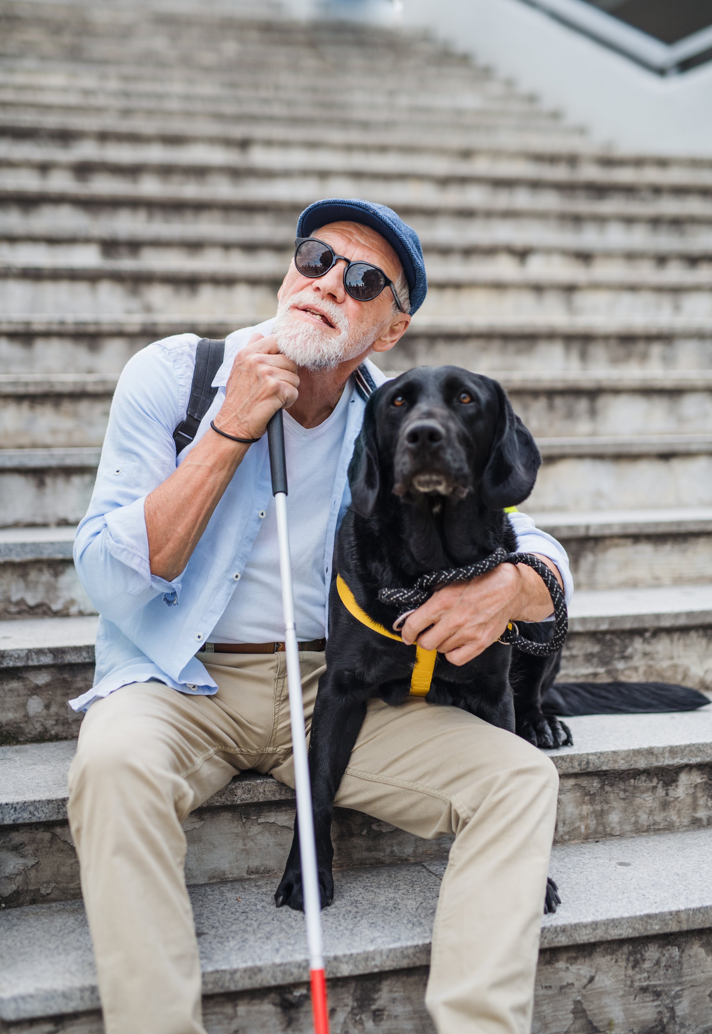
Recently a post circulated on social media showing a person with a walking stick using a smartphone. Someone commented that the person must be faking their disability if they can use a smartphone. If we showed more blind people doing all kinds of activities that they are capable of, maybe this wouldn’t happen as much.
It’s also important to pay attention to the language we use in photo captions, such as “confined to a wheelchair” or “wheelchair bound.” Great illustration: On Oct. 31, 2021, author and disability advocate Tara Moss shared a photo of herself fake-tied in ropes, sitting in her wheelchair. “I call my Halloween costume this year ‘wheelchair-bound’,” Moss said in a video. “Yeah, like this is literally the only time it’s appropriate to say that, okay?’” Instead, say “(person) uses a wheelchair.” Moss also, in various tweets, refers to her wheelchair as her “freedom machine,” which is awesome.
The image on the left is problematic because it shows a blind person who needs help to get up off the couch even with the aid of a cane. The image on the right is better because it shows a blind person who is able to be out in the world independently with the use of a cane and guide dog.
Red Flag #2: Images with inappropriate aids
Imani Barbarin, who “writes from the perspective of a black woman with Cerebral Palsy,” is also known on the internet as Crutches and Spice. She described in a TikTok video why stock images depicting wheelchair users in hospital-grade wheelchairs are problematic. Watch it here, but quick summary, she tells us that hospital-grade wheelchairs are often ill-fitting, and “ill-fitting wheelchairs can kill disabled people.” Instead, she chooses images that show more appropriate, customized chairs. The same theory applies to other types of aids, mobility and otherwise.
The image on the left is problematic because it shows a person using a hospital-grade wheelchair that isn’t fitted to his body. The image on the right is better because it shows a person using a more fitted, custom wheelchair that is appropriate for every day use.
Red Flag #3: “Inspiration porn.”
This is when we show disabled people as perfect and inspiring. You know … “She became a doctor in spite of blah blah disability blah blah.” No. Inspiration porn doesn’t benefit the disability community. It serves non-disabled folks more than by making them feel more comforted by the idea that you can “still” achieve incredible things – or basic things – while being disabled.
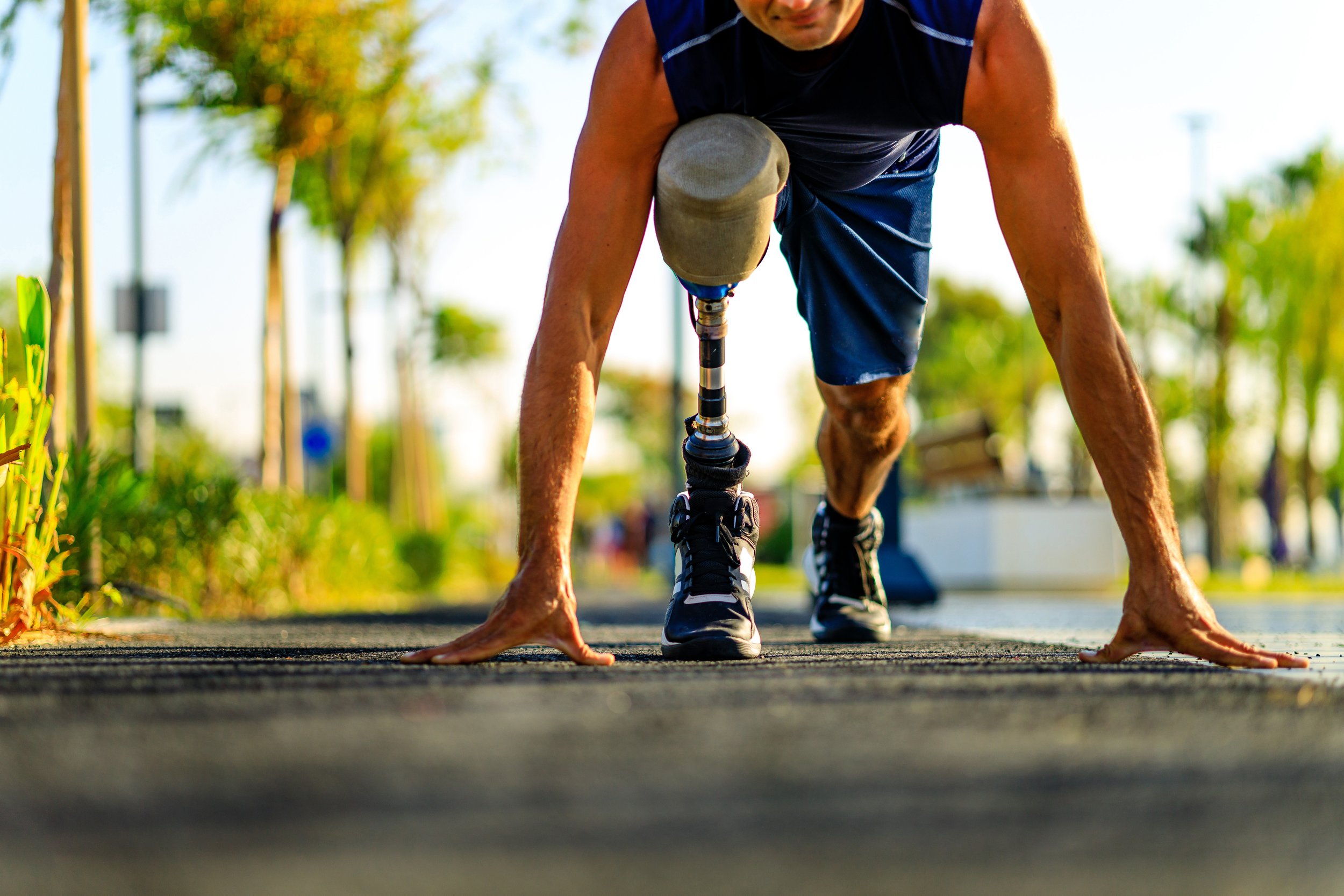
The late comedian Stella Young introduced the term “inspiration porn” in her 2014 TedxSydney talk, “I’m not your inspiration, thank you very much.” She used the term, she said, because the so-called “inspiring” images like a child with no hands drawing with a pencil held in her mouth “[objectifies] one group of people for the benefit of another group of people.”
She cited a quote attributed to skater and Olympic gold medalist Scott Hamilton: “The only disability is a bad attitude.” That theory, Young said, is bullshit – her word. “No amount of standing in the middle of a bookshop and radiating a positive attitude is going to turn all those books into braille. It's just not going to happen.”
The image on the left is problematic because it shows a person with a prosthetic limb doing a challenging and therefore inspiring activity, which speaks more to non-disabled audiences. The image on the right is better because it shows a person with a prosthetic limb living out average everyday activities.
I want people to see that people with disabilities – visible or invisible – don’t have to be either a tragedy or an inspiration to be worthy. Much of our experience exists in between those. The imagery and narration in this video for the #WeThe15 campaign from the International Paralympic Committee really hits home the spirit of what I’m talking about.
As I mentioned before, I’ll be revisiting the topic of disability representation in design from time to time, focusing on different specific subjects. I’m eager to keep on learning, so I’d love to hear from you. What do you want to talk about?
Finally, please read this – I won’t call it inspiring, but just really absolutely fabulous – letter that Stella Young wrote to her 80-year-old self.
CHANGE MAKER OF THE MONTH
This month, I’m spotlighting and supporting Everytown, the largest gun violence prevention organization in America. Too many American lives are lost to gun violence that can be prevented.


