Locavino Wine Cafe
PROBLEM
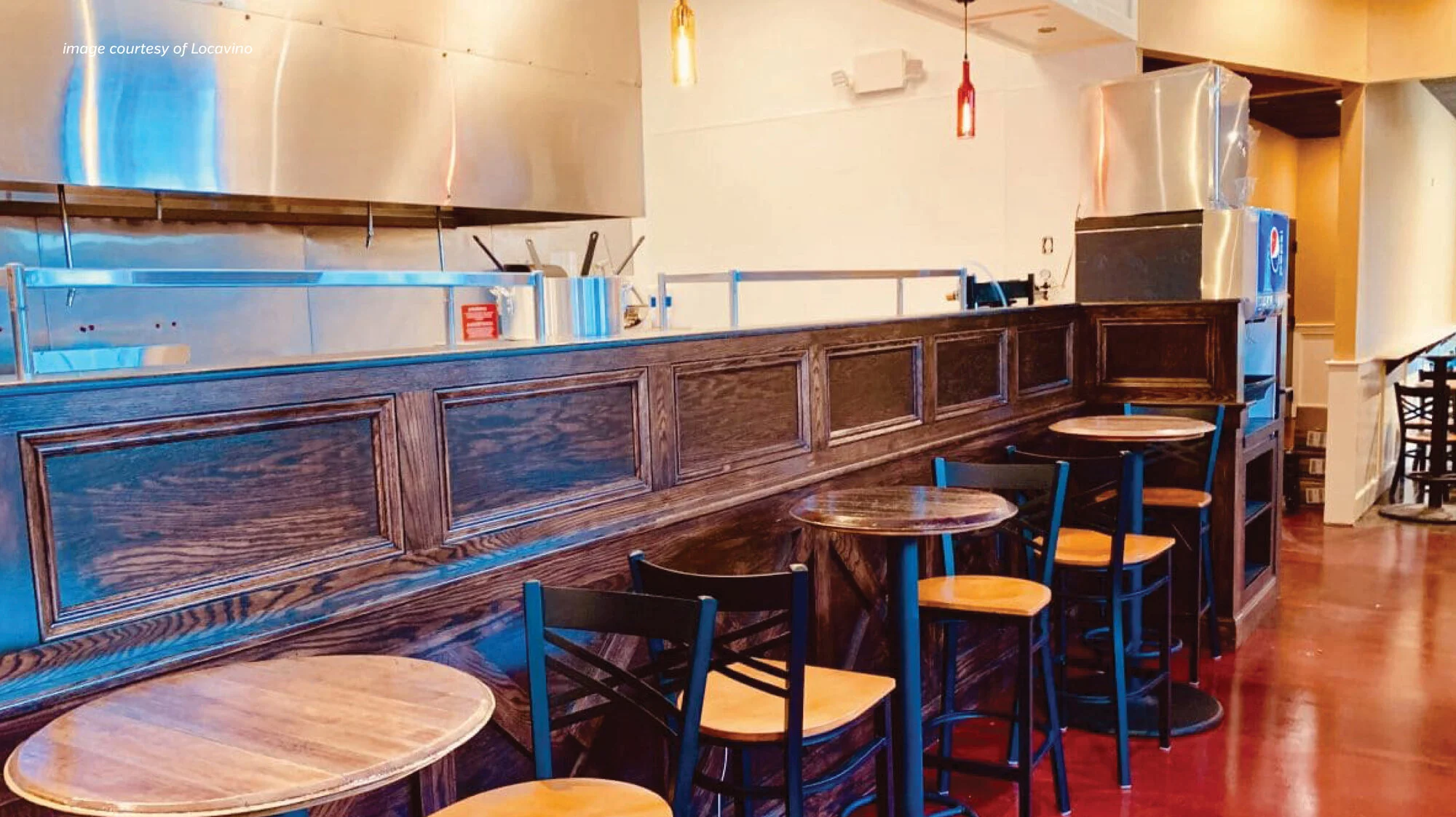
When Locavino was preparing to open, they knew they wanted to provide good wine, good food, and good experiences that make an imprint on the customer. To do this, they need to build a visual look & feel which communicates the quality and legitimacy of the brand while still feeling relatable and local.
SOLUTION
We collaborated to create a logo and visual identity which reflects the qualities that make Locavino unique. Bold typography and inviting colors emphasize the warm and relatable personality of Locavino’s atmosphere and offerings. The logo icon was specifically chosen because the illustration resembles a diagram of what goes into making a great wine & this relates to how they want to educate customers about local wines. In the branding process I developed a core color palette, suite of icons and adaptable menu template that the team was able to use to emphasize their branding throughout the space.
RESULT
From their launch, Locavino was empowered with a memorable visual identity which clearly communicates their personality to customers and establishes their position as a credible resource.