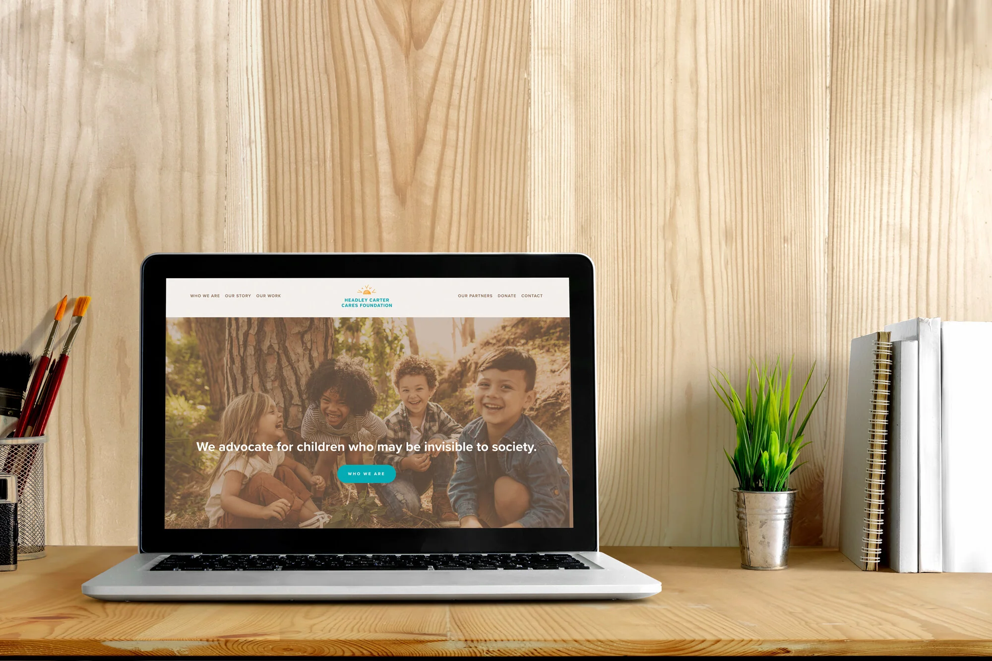
Behind the Scenes with Headley Carter Cares Foundation
Hi, and happy July! I hope that you’re all enjoying your summers in spite of some … limitations that might be at hand due to coronavirus. My husband and I are working on setting up a fire pit in our backyard so at least s’mores are in our near future!
This month, I’m looking back on what I learned from working with Headley Carter Cares Foundation, a Maryland-based, Black women-run nonprofit that serves the ongoing needs of students who have emotional, behavioral or social difficulties. What sets this organization apart is that instead of one-time grants, the HCCF provides long-term scholarships for children to take part in after-school and summer programs. The work is inspired by founder Marcia Carter’s experience as a behavioral therapist.
new branding and website design for Headley Carter Cares Foundation
I connected with Marcia and HCCF through writer and editor Jacqueline Carter (no relation), whom I’ve collaborated with before through Creative Colony and SW Creatives. When Jackie started working with HCCF to revamp their branding and messaging, she saw that the visuals they had in place “didn’t reflect [Marcia’s] vibrancy or her spirit,” she said. “Listening to what her thoughts were about the future and learning more about the foundation, I thought they had a bigger story to tell.”
Marcia had also shared concern that their current website, was “dated and very limiting. We desired to expand and appeal to a wider segment of potential donors.” One specific aspect she wanted to redo was the logo — previously a dove, which she noted can have religious connotations (HCCF is a secular organization).
With these goals in mind, we brainstormed together and talked more about what makes the Headley Carter Cares Foundation stand out. Initially, we were thinking the design should go in the direction of being bright, colorful, active, and really inspiring and upbeat. In diving deeper, the importance of the resilience and the growth of the students HCCF works with became a common theme. Through our conversations, it became clear that the site should speak to how much they care. Marcia put it really well: “We care about those who don’t have a voice. We focus on their strengths. We want to convey that although you have challenges, you have so many strengths.”
Mood Board 1: bright and fun direction
Mood Board 2: mature and thoughtful direction
With this clarity, we looked at mood boards (we’ll talk more about those in another post!) that showed the bright and fun direction versus something more mature and thoughtful. It became clear that HCCF’s work had a bit more weight and emotional investment than the bright colors portrayed. Ultimately, we landed on a more grounded and soothing visual direction that honors the challenges and resilience of the students they work with.
I like how Jackie describes the new look and feel: “The overall design is light and airy. You get an idea of the love and support that HCCF offers. The people work from their heart.” I think it is so important to make that clear first impression with the colors and imagery we use on the site.
final logo design and color palette for Headley Carter Cares Foundation
As for the logo, we chose a sun, which can be interpreted a few ways: It can represent warmth, care and nourishment, or it can represent the sun rising after a dark time. It can go as deep as the person viewing it wants to go but it always connects back to the mission of the organization.
I learn — or relearn — something from every project I work on, and this one enforced the idea that you can’t really know at the beginning how a design will turn out. Letting the design grow and evolve from our conversations was really powerful, and I was honored to be part of helping the Headley Carter Cares Foundation realize their vision.
Thanks for coming along on this little walk down memory lane with me. It was fun to revisit my time working with HCCF. They’re a great organization doing important work. If you want to support their efforts, here’s a link to their donation page. I’ll be making a donation to their efforts this month as well!
Next month, I’ll delve into one of the most important aspects — I think! — of the design process: The design brief. Until then, stay safe and take care!
All the best,
Christy


